Good UX Over Aesthetics
Published: 05/09/2019
Google's Android 10 dropped recently and I've been using it for the last two days on my primary phone. One of the features I was excited about with this release was the updated gesture navigation. I had my fingers crossed for Google to finally get this right.
So, did they? In my opinion, yes, they did!
However, while using my phone over the last two days, I found an annoying this Google Keyboard (GBoard) is doing as a result of using the new navigation system.
The Annoyance
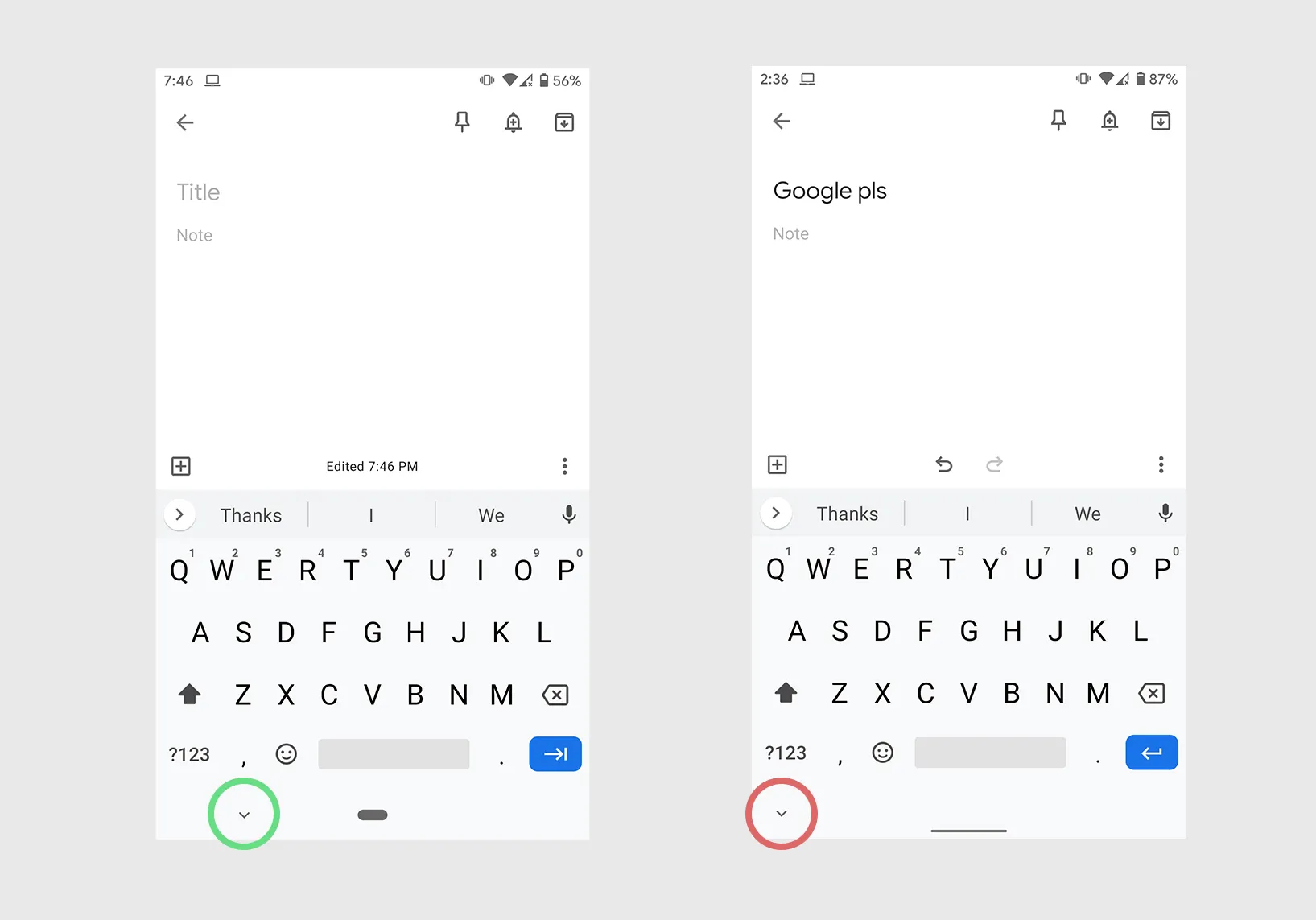
Look at the image below, specifically at the highlighted buttons. These buttons are used to hide the keyboard when you no longer want it visible.

With Gesture Navigation turned on (image on the right), GBoard puts the “hide keyboard” button on the far-left. This makes it hard to reach when using the phone with one hand (my preferred way to use a phone).
Also, keep in mind that I'm making these observations on my relatively small Pixel 2, just imagine how bothersome this would be on a 6+ inch OnePlus 7 Pro…
The image on the left however is how GBoard handles the “hide keyboard” button when using Android Pie' 2-button navigation. This placement is much more comfortable for the user. The button is pushed-in from the left edge which makes a big difference when trying to tap it with one hand. Me likes!
It's not important to have symmetry (or other aesthetically pleasing features) in a UI at the cost of a user's experience. By having the button on the far-left of the navigation bar, you get a more pleasing UI but end up annoying your users.
The Fix
It's simple really. Just push the button in from the left by some density-dependant unit. It's okay. I know, it looks slightly worse but it makes your users feel delightful every time they tap the button.
